
Dynamics

|
Generational Dynamics |
| Forecasting America's Destiny ... and the World's | |
| HOME WEB LOG COUNTRY WIKI COMMENT FORUM DOWNLOADS ABOUT | |
|
These pages contain the complete manuscript of the new book
Generational Dynamics: Forecasting America's Destiny,
written by John J. Xenakis.
This text is fully copyrighted. You may copy or print out this
material for your own use, but not for distribution to others.
Comments are invited. Send them to mailto:comments@generationaldynamics.com. |
This chapter is unlike the rest of the book, but is included here for one principal reason: To provide the analytical evidence that we're currently entering a new 1930s style Great Depression. This book presents two different types of evidence, both of which point to the same conclusion: The generational evidence is presented in chapter 6 (page [depression]), and the analytical evidence is presented at the end of this chapter (page [trend#171]), once the foundations have been laid. Since this chapter is a bit more mathematical than other chapters, most readers should feel free to skip it.
However, once this chapter is included, it serves other purposes as well. This whole book is about trend forecasting, mostly generational trend forecasting. This chapter describes other types of trend forecasting, including the very mysterious technological trend forecasting.
This chapter provides emotional support for the rest of the book in the following way: Some people believe that it's impossible to forecast anything whatsoever about human behavior, and reject Generational Dynamics for that reason alone. This chapter shows that in fact some kinds of forecasting do indeed work, and so total non-believers will have to rethink their beliefs.
There are many different kinds of trends. Some trends can be forecast or predicted in the short term, some in the long term, and some not at all.
| |||||||||||||||||||||||||||||||||||||||||||||||||||||||||||||||||||||||||||||||||||||||||||||||||||||||||||||||||||||||||||||||||||||||
This chapter summarizes the different kinds of trends, and provides information on what kinds of forecasts and predictions can be made.
Let's start with a summary of the different kinds of trends.
The most obvious example of a cyclic trend is the seasons -- spring, summer, fall, winter. The same seasons keep repeating over and over again. Furthermore, they're completely predictable: you can always be certain the next Spring will start exactly one year after the last Spring began.
Here are some other examples of cyclic trends:
The above are all examples of cyclic trends. An interesting distinction can be made between global and local cyclic trends, which I won't discuss further here.
Cyclic trends usually apply to values that remain relatively the same over long periods of time. Any increases or decreases are only temporary.
Growth trends apply to values that grow over long periods of time. In particular, when some value in nature grows, it almost always grows at an exponential growth rate, and so we'll restrict our discussion to exponential growth trends.
However, it's a little more complicated: Most populations (including humans) will tend to grow faster than the amount of food available to feed that population. When the population grows to the point where not enough food is available, then a segment of the population is killed -- by famine, by a disease epidemic, or by war. This is the "Malthusian problem" that we'll discuss more below.
For example, how many shoes are manufactured each year? I don't have the figures, but I assume that it's one or two pairs per person around the world, and that's probably been true for centuries. Thus, the number of shoes manufactured each year grows exponentially because the population grows exponentially.
Here's a crucial fact: If there's a temporary perturbation in the size of the population, it will affect the shoe trend. For example, if a world war or an epidemic temporarily causes a 20% drop in the population, then the number of shoes manufactured will probably drop about 20% as well.
How much energy is used each year? Once again, I don't have the figures, but I would expect the amount of energy used per person worldwide to be growing exponentially. So the total amount of energy used by the entire population grows at a faster exponential rate than the population itself.
An example is the power of calculating machines and computers, which has been growing at an exponential rate for over a century, but with no relationship to the population size.
Technological growth is not affected by perturbations in the size of the population. For example, if a world war or epidemic killed 20% of the population, the power of desktop computers would NOT drop 20%. It would stay the same. So the power of desktop computers is unrelated to population.
Actually, it wouldn't stay the same: It would continue growing at exactly the same rate. This is the fascinating thing about technological growth -- that it's on a growth path entirely its own, completely independent of population, wars, politics or skirt lengths.
The mysterious thing about technological growth is the steadfastness with which exponential grow trends are maintained for decades or centuries, across wildly varying technologies. We'll discuss several examples of this later.
It's worth mentioning briefly that sometimes a trend value can combine both cyclical and growth elements. Graphically, this is shown when the overall trend grows exponentially over time, but the actual value oscillates up and down, above and below the exponential trend line, as it follows the trend line. We'll give an example of this with stock prices.
As we've said, generally speaking, for any population of humans or animals, a certain percentage of the population will have offspring each year, and a certain percentage will die. These percentages tend to be roughly the same each year. The result is that the population tends to grow by the same fixed percentage each year, which is the formula for exponential growth.
To understand what exponential growth means, think about some of the statements you see commonly in newspaper and magazine articles all the time. You might read "the number of AIDS cases increases by X% per year" or "the number of people owning cell phones increases by Y% per year."
Sometimes these statements are made in a different way, but one that is mathematically equivalent. You might hear, "Such and such doubles every 18 months," or "triples every 5 years."
Statements like this are extremely common in the news. What the statements all have in common is that a population (or quantity) changes by a fixed constant ("increase by X%" or "doubles") every fixed time period ("per year" or "every five years").
Any population or quantity that exhibits such constant change is said to change exponentially, or exhibit exponential growth.
For example, if some quantity X doubles every year, then in successive years, the quantity will have the values 2X, 4X, 8X, 16X, 32X, 64X, 128X. Exponential growth can be very rapid.
 |
Take a look at the adjoining graph. It shows the population of England and Wales from 1000 to 2000. The black dots on the graph are the actual population values for the years shown.
Notice that the population took a sharp drop in the 1300s because of the Bubonic Plague (Black Death) that killed huge numbers of people around the world. Later, there was a sharp increase in the rate of population growth around 1750, evidently because prosperity from the Industrial Revolution made mothers want to have more children.
What these incidents show is that population doesn't grow steadily. Sometimes it speeds up; sometimes it slows down or even drops. But in the long run, it always follows an exponential growth trend line.
That trend line is also shown on the graph as a thin curved line. Notice how the actual population oscillates above and below the trend line, but never strays far away.
What does the trend line represent? For simplicity, think of the trend line as representing the amount of food being grown in England and Wales (or, more precisely, the number of people who can be fed by the food being grown). When the actual population falls below the trend line, then food is plentiful and women have more children, pushing the population curve up. When the population curve gets above the trend line, then there's not enough food, and people begin starving to death -- unless they're killed by war or disease.
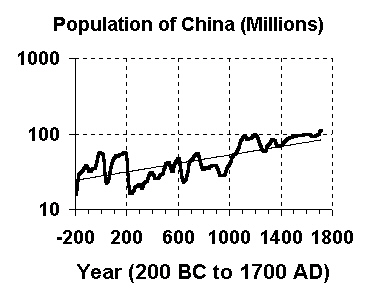 |
The next graph shows this more clearly. This graph displays exactly the same data as the preceding graph, except that the y-axis is measured using a logarithmic scale, instead of an evenly spaced linear scale. This means that the evenly spaced y-axis values are 1, 10, 100, and so forth, with each value being ten times the previous one.
When this is done, exponential curves turn into straight lines. This makes it very easy to visually verify that the data values are, in fact, exhibiting exponential growth.
The reason that economics is called "the dismal science" is largely because of a book, Essay on Population, by Thomas Roberts Malthus, published in 1798.
This book shocked the British populace because it was the first to lay out the awful truth: That since population would always grow faster than the available food supply, there would always be starvation.
He even made some social recommendations. However, his recommendations would be considered bizarre by today's standards:
Instead of recommending cleanliness to the poor, we should encourage contrary habits. In our towns, we should make the streets narrower, crowd more people into the houses, and court the return of the plague. In the country, we should build our villages near stagnant pools, and particularly encourage settlements in all marshy and unwholesome situations. But above all, we should reprobate specific remedies for ravaging diseases: and those benevolent, but much mistaken men, who have thought they were doing a service to mankind by projecting schemes for the total extirpation of particular disorders. If by these and similar means the annual mortality were increased ... we might probably every one of us marry at the age of puberty and yet few be absolutely starved.
It's hard to read these two paragraphs without laughing. His recommendations were never adopted, but I guess that they made sense to him: since millions of people are going to die anyway, why not help it along? Fortunately, today's societies could never tolerate any policy that would allow politicians to decide who lives and who dies.
Nonetheless, Malthus' basic conclusion is true. Nature has provided us with a powerful sex drive to cause us to have too many children for the available food supply to support, and nature has provided us with famine, disease and a built-in desire for genocidal war as ways to make sure that enough people die off, and to select the people who survive to the be the tribes, societies and nations that are the best equipped and most able to survive.
Generational Dynamics adds to our understanding of Malthus' predictions by providing insight into one of the mechanisms that nature (or God) provided us with to get rid of excess people.
The most bloody, violent and genocidal wars occur in 80-year cycles, the length of a human lifetime. Whether we like it or not, wars are not senseless, at least not to nature's (or God's) overall purpose in regulating population size on earth.
This is an aside to the main point of this chapter, but it's interesting because it shows how simple mathematical arguments can be applied to the problem of governing large populations.
In 1991, I visited CeBit, the huge computer show in Hanover, Germany. It was a special occasion because the Berlin Wall had just fallen, and East Germans were visiting the show for the first time. "They're in a state of shock," I was told. "They're still using punched card equipment from the 1950s." Why had Communist East Germany gotten stuck in the 1950s?
Cuba's another example: They're still using 1950s automobiles. Why?
Why do Communist countries become frozen in time? It turns out there's a good reason, and it can be proven mathematically.
The branch of mathematics is called Complexity Theory. This branch was developed for computers to answer the questions about how long it will take a computer to solve certain types of problems. For example, suppose it takes a certain computer program one hour to process 1,000 data values. How long will it take the program to process 2,000 data values or 3,000 data values?
It depends on what the computer program does with the data. It some cases it will take 2 hours or 3 hours, respectively, but in other cases it will take 4 hours or 9 hours, respectively. Complexity Theory sorts all that out.
Malthus' argument, described in the last section, was essentially a Complexity Theory argument.
Now, if we apply the same concepts to governing the population of a Communist state, we see why Communism has to fail.
In order to provide a worker's paradise, Communism requires that every financial transaction be price-controlled, so that no entrepreneur can make an unfair profit. The state determines how much any store manager can charge for a product, so that poor people are not taken advantage.
As a practical matter, that means that each time a new service is offered, or a new kind of product is developed, or is manufactured in a new way, or is distributed in a new way, or is sold with different kinds of customizations, some bureaucrat has to make a decision on how much may be charged for that product or service.
Now, how many how many government bureaucrats does it take to do all this? That's the problem. Let's do a little computation.
The population of the country grows exponentially with time, so let's assume that the population is P = A ept (A times e to the power p times t) as a function of time t. The number of products and services grows at least proportionately to the number of people, so let's make a conservative estimate that the number of products and services uses the formula P = B ept. Assuming that each transaction involves two people, the number of transactions will be T [[**Error** Macro 'C' is illegal **]] faster rate than the population grows. In order to enforce the economic controls, a fixed percentage (at least 1%) of these transactions will have to be monitored. So, as the population grows, it requires a greater and greater proportion of the population to enforce the economic controls, and so Communism falls apart.
That's why Communist countries like North Korea, East Germany and Cuba were stuck in the 50s. They had to freeze the introduction of new products, because their bureaucrats could never keep up with the economic controls on an exponentially growing product set.
That's why, once the population becomes large enough, larger than a few million people, a free market is the only form of economic management that's mathematically possible.
Using similar Complexity Theory arguments, it's possible show mathematically why feudal government had to give way to monarchies, and why monarchies had to give way to republics. (We already discussed this in conjunction with the French Revolution in chapter 8, p. [westeurope#178].) The argument is similar in all cases: As the population grows, the number of transactions between people grows much faster, and so the only forms of government that work are those that do not require the government to monitor individual transactions.
One more point: Some historians have claimed that Western civilizations invented representative government and forced third world countries to adopt it. These complexity theory arguments show that representative governments (republics) are in fact the only ones that are mathematically possible.
Technology growth is very mysterious because it also grows exponentially, just like population, but has nothing to do with population.
Let's repeat the example given previously: The number of shoes manufactured each year depends on the size of the population, and so it grows exponentially as the population grows; and if a plague kills 20% of the population, then the number of shoes manufactured in the next year will be 20% smaller, because the population is smaller.
But the processing power of calculating machines and computers also grows exponentially, but has nothing to do with population. If a plague kills 20% of the population, then the power of computers will not only NOT go down, it will actually continue to grow steadfastly at the same exponential rate as before.
The best way to understand this is to look at several different kinds of examples.
Let's return to an example briefly considered earlier -- Thomas Edison's invention of the incandescent light bulb.
You know that Thomas Edison invented the light bulb in 1879. Well, suppose Thomas Edison had never been born, and so could never have invented the light bulb. Does that mean we would we still be using candles instead of light bulbs?
The answer is no: If Edison hadn't invented the incandescent bulb, then someone else would have invented it shortly thereafter. There were several other inventors working on the same problem at the same time, and one of the others would have gotten the patent if Edison hadn't. One of the others, Joseph Swan, actually invented an improved light bulb, with the result that Edison and Swan went into partnership together.
That's the point: that technological advances come at exactly the right time.
Edison's light bulb is only one of many very different technologies that have been used to produce artificial light.
The adjoining graph shows various inventions of artificial light sources, using wildly different technologies. The "efficiency" of a light source is a measure of how little energy is wasted in heat: If a light bulb gets hot, then it wastes a lot of energy in heat; if it stays cool, then it's using energy much more efficiently.
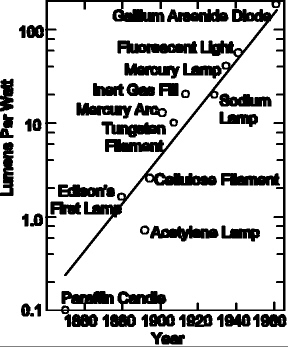 |
Notice in the adjoining graph how new inventions have been improving the efficiency of artificial light sources over time, and how the efficiency has been growing exponentially. Also, notice how each new invention comes at exactly the right time to maintain the steadfast exponential growth.
This graph illustrates how mysterious technological growth is. Why should all these wildly different technologies produce light sources that increase efficiency according to a well-defined predictable growth curve?
Notice also that these technological advances have absolutely nothing to do with population.
This is a very interesting example because it refutes a commonly held misconception about the history of aircraft: That the jet plane was invented because of World War II.
The graph below shows the top speed of combat aircraft since 1909. There were numerous technological innovations, including the closed cockpit, the monoplane, the all-metal airframe, and the jet engine.
When the jet engine was introduced in 1944, many people thought that it was invented because of World War II, and that it brought about a sizable jump in the speed of combat aircraft.
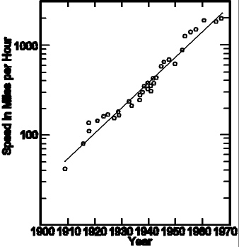 |
However, that's not true. The jet engine was introduced at just the right time to keep the previous trend going, and it did not bring about a significant jump in speed, indicating that it would have been introduced at this time even if it had been a time of peace.
What the jet engine did do was to supply a brand new technology that allowed combat aircraft to stay on the same exponential trend line, at a time when the speed of propeller-driven aircraft was topping out.
All of these examples illustrate the same thing: the relentlessness of technological improvements when following exponential growth curves.
This final example is included to illustrate an interesting point.
We've been distinguishing between exponential growth based on population and exponential growth based on technology. Can you have both kinds of growth at the same time?
The graph below displays the growth in installed technological horsepower in the U.S. As we'll see, it indicates that the total installed horsepower is growing exponentially -- and that's related to the growth in population -- but also, the installed horsepower per person is growing exponentially, and that's probably mostly due to technological improvements.
But let's start at the beginning. What do we mean by "installed technological horsepower"? We're talking about such things as electrical generators or any motors that generate electrical or other power. To keep it simple, we're saying that we're generating more electricity and other forms of power, and the growth is exponential. Of course, this is sometimes a controversial political issue, since Americans use more power per capita than most other people in the world, raising environmental issues.
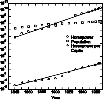 |
Notice the following:
This example shows how different exponential growth effects can be combined into a single growth trend.
We'll look at one final example of technologic growth, the computing power of computers.
Back in 1964, I had a summer job computer programming for Honeywell Corporation, and I well remember a conversation I had with the engineer sitting at a nearby desk. He said, "Computers can't get much faster. The circuits in today's computers require signals to travel at almost the speed of light, and there is no way to get around that. Thus, computers may get a little faster, but not much faster than they are today."
He was making the point that for computers to get any faster, the signals that move around within the computer would have to move faster and faster. But since nothing can move faster than the speed of light, the speed of computers is limited.
Of course, computers have gotten a lot faster since 1964. The fascinating thing is that if a large powerful supercomputer fills most of a room, then ten years later a desktop computer will be more powerful than that old supercomputer was. And this keeps happening -- the end is not in sight. (See http://www.top500.org)
How do you measure the rate at which computer power has been increasing? One answer is provided by Moore's Law, the most well-known exponential growth prediction, and this prediction was made in the early 1960s, right around the time that my friend was telling me that computers would not get much faster because signals could not travel faster than the speed of light.
Moore's Law predicted in the early 1960s that the number of transistors on a computer chip would grow at an exponential rate. History has shown that the number of transistors on a computer chip has been doubling every 18 months or so since then, and so the power of computers has been doubling every 18 months. (The prediction was made by Gordon Moore of Intel Corp. For more information, including a link to his original paper, see http://www.intel.com/research/silicon/mooreslaw.htm -- however it's interesting to note historically that Moore's original prediction was that the number of transistors would double every year, rather than every 18 months.)
How does Moore's Law get around the speed of light problem?
When my friend told me in 1964 that the speed of computers was limited by how fast signals could move around the various computer components, he overlooked the fact that the distances between the computer components could be reduced substantially.
When transistors are packed more densely on a computer chip, it naturally means that the transistors are closer to one another. Therefore, signals traveling from one transistor to another have to travel shorter distances, and so they can move from transistor to transistor much faster, without violating the principle that they can't travel faster than the speed of light.
When Moore's Law predicts that the number of transistors on a chip will double every 18 months, that's an example of exponential growth. The real power of forecasting exponential growth becomes most evident when you draw a graph of such values.
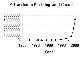 |
The adjacent graph shows the number of transistors per chip for various Intel Corp. chips that have become available over the years, starting from an experimental 1965 chip with 50 transistors, the Intel 4004 chip from 1971 with 2,250 transistors, all the way up to the Pentium 4 processor from the year 2000 with 42 million transistors.
As you can see, the graph seems fairly flat until around 1985, and then it really takes off very quickly. Since all the values before 1985 are fairly small, it's hard to read them individually.
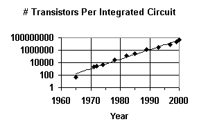
That's why it's common practice to graph exponential values using a logarithmic scale, as shown on the graph below. Notice that the y-axis values are 1, 10, 100, and so forth, with each value equal to ten times the preceding value.
When this is done, exponential curves turn into straight lines. This makes it very easy to visually verify that the data values are, in fact, exhibiting exponential growth.
What's remarkable about Moore's Law is that it was formulated in the early 1960s, even though there was absolutely no way, at that time, to predict what new technologies would be needed to make the prediction come true. And yet, the prediction has come true, with steadfast reliability.
 |
However, the number of transistors can't keep doubling forever. Experts estimate that the natural limit on the density of transistors will be reached around 2015, after which further doubling would violate the laws of physics.
But that doesn't mean that computer power will level off in 2015. That's because new technologies will be coming along to replace transistors and integrated circuits.
To see that, let's step back for a moment. Ray Kurzweil has gone back as far as the late 1800s to show that computing speed started increasing exponentially long before integrated circuits were invented. Just like the previous examples we've seen -- artificial light sources, speed of combat aircraft, and so forth -- the speed of computers has been growing according to a predictable exponential rate through may wildly different technologies.
Here's the list of technologies identified by Ray Kurzweil  :
:
Kurzweil has shown that all of these technologies cause computing speed to increase according to a steadfast, predictable exponential growth curve.
We've already said that computing power due to improvements in integrated circuits will level off around 2015. What technology will replace them?
We can't be absolutely certain, of course, but there are two different candidates today:
One of these technologies, or a combination, will cause an explosion in computer power in the 2010s and 2020s. As computers become increasingly powerful, they'll also become increasingly intelligent, and by 2030 or so, computers will actually become more intelligent than human beings.
It may seem surprising, but many sociological changes can be related to technology. We'll present here a sampling.
Why would the divorce rate be related to technology?
In past centuries, there were many structural factors preventing women from either getting divorced or working outside the home: Taking care of kids really was a full time job. It took all day for a woman to cook a meal from scratch, using vegetables from the garden, along with meat that her husband had obtained by hunting and killing an animals. Making clothes for the family was another major factor.
However, technology has been providing many labor saving devices, reducing the amount of time that a mother has to stay home, unless she chooses to do so. Vegetables and cuts of meat are purchased already prepared in the supermarket, modern ranges and microwave ovens speed up cooking, dishwashers reduce cleanup time, washers and dryers reduce laundry time, and vacuum cleaners reduce house cleaning time.
As technology provided more labor saving devices for the home, women became freer to work outside the home and earn incomes independently, also giving them the freedom to divorce at will.
With that background, let's see how the divorce rate has been increasing exponentially. We'll look at two different measures of the divorce rate, because this will give us an opportunity to examine how different measurements can give slightly different results.
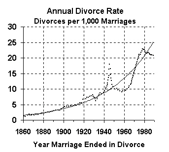 |
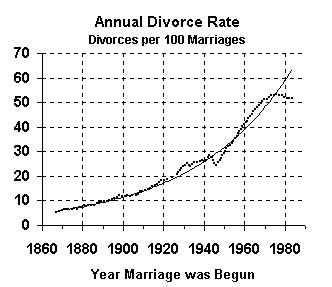
The first method for computing the divorce rate is to measure the number of divorces in a given year as a fraction of the number of marriages in that year. This method shows, for each year, how likely a divorce is to occur in that year.
The above graph shows the number of divorces as percentages of the number of marriages in the same year. This is the way that the Census Bureau normally presents divorces, although it causes confusion because it measures the number of divorces, but not the proportion of marriages likely to end in divorce (which we'll present later).
This is a good example of exponential growth because it illustrates how a value can grow exponentially as an overall trend, but still oscillates above and below the trend line.
The last graph shows that many divorces occurred during World War II, but the number of divorces dropped significantly after the war. Still, on an overall basis, the divorce rate has been growing exponentially.
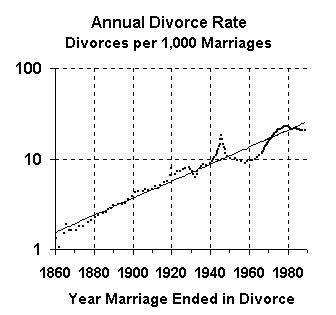 |
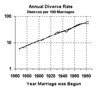
This graph uses the same data as the preceding one, but this graph has a logarithmic scale, so that the exponential trend becomes a straight line.
When using a linear scale (as in the first graph), recent values become exaggerated, and historical values become diminished in importance. However, when a logarithmic scale is used, then recent and historical values receive equal treatment and emphasis.
Now let's look at the divorce rate based on year of marriage.
This graph measures the rate of divorce in a different way, as the number of marriages ending in divorce. While the previous graphs showed the divorce rate in the year of divorce, this graph shows the divorce rate by the year of marriage.
These are the divorce figures that are most often quoted in the press, and they indicate that about 50% of all marriages end in divorce. However, unlike the previous set of figures, these figures are based on Census Bureau estimates. Why? Because the Census Bureau can get data on how many divorces occur in a current year, but they have no way of collecting data on how many of this year's marriages will eventually end in divorce; those figures have to be estimated.
 |
The next graph, with a logarithmic scale, shows clearly how these data values have been closely hugging the exponential trend line, much more closely than the divorces per 1,000 marriages figures do.
Why is that? Both sets of figures -- based on year marriage ended in divorce and on year marriage was begun -- follow an exponential growth curve, but why do the first figures oscillate wildly at times, while the second figures show very little oscillation?
The answer is simply that people time their divorces based on current political and economic conditions. Thus, people postponed divorce during the depression, because money was scarce, but then got those postponed divorces during the war, when economic times were better.
 |
The two sets of divorce figures we've just used were published by researcher Andrew J. Cherlin in 1992. At that time, there was a big puzzle in the research community: The divorce rate had begun to level off in 1975. Would it continue to stay level, or would it start to increase again?
Everyone knew that the divorce rate had to level off some time; after all, the divorce rate could never exceed 100%, and so it had level off sometime before reaching 100%. But had that leveling off in fact occurred at 50%?
Census figures since 1990 now show that in fact the divorce rate has leveled off at 50%, and so the puzzle seems to have been solved.
This illustrates a standard phenomenon in exponential trend forecasting: That exponential trends start to level off when they reach some physical barrier.
However, in the case of technological trend forecasting, we've seen that when a particular technology begins to level off, a new technology replaces it, as in the examples we've already seen:
Now that the divorce rate has leveled off, the question arises: Have we been measuring the wrong thing? In the case of computers, if we measure the number of transistors on a chip, then we know that that will level off before 2015, but if we measure instead the power of "calculating machines," then we get an exponential trend line that continues through numerous technologies.
The question is: Is there something else we can measure that will continue the exponential growth of the leveled off divorce curve?
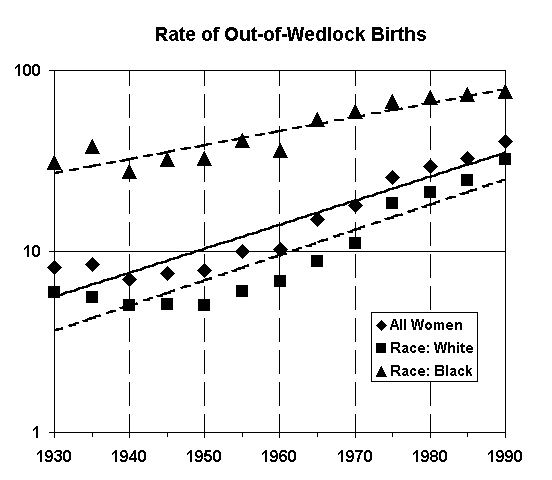
There appear to be other candidates, a likely one being "number of children born out of wedlock." This graph shows that these values exhibit exponential growth for all women, and for black and white races. The values for black mothers are nearing 100% and so should be topping out, while the figures for white mothers still have a while to go before they catch up.
 |
Future biotechnology developments, such as cloned human beings and modified DNA, may provide the technological means to keep this exponential growth trend on track. Work in this field by researchers can identify the precise measure to be used.
In chapter 6, we described how generational trends lead us to conclude that we're entering a new 1930s-style Great Depression.
The same conclusion is also supported by standard trend forecasting techniques of the kind that we've been describing. In this section, we summarize those results.
 |
In the long run, the value of a company is represented by its stock price. Good news may push a stock price up temporarily, and bad news may push a stock price down temporarily, but in the long run, the stock price will return to the value of the company. More precisely, over a long period of time, the value of the company will be accurately represented by its market capitalization, which equals its stock price times the number of outstanding shares.
The value of a single company may go up or down, but the value of all companies together should increase exponentially for two reasons: (1) As the population increases exponentially, the number of customers increases exponentially, and so does the company value; (2) As technology improves, companies' productivity and efficiency will grow exponentially, and so will the companies' value.
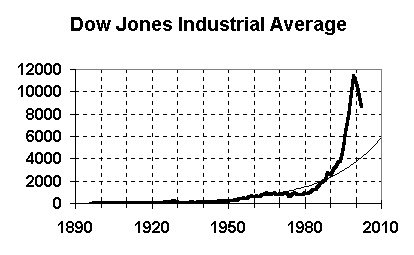
So, standard stock market index values represent the aggregate values of stocks, and the values of stocks represent the values of the corresponding companies. Thus, we expect the values of standard market indexes, such as the Dow Jones Industrial Average and the S&P 500 Index to increase exponentially.
The above graph shows the value of the Dow Jones Industrial Average (DJIA) since 1896. This graph shows how spectacular the bubble of the late 1990s was. The thin line is the exponential growth trend line, and you can see how the DJIA far exceeds the trend line.
In early 2003, the DJIA index was in the 8000s. This graph shows that the trend value in 2010 is just below 6000 -- it's actually about 5800.
To see more clearly what's going to happen, take a look at the same graph, but with a logarithmic scale.
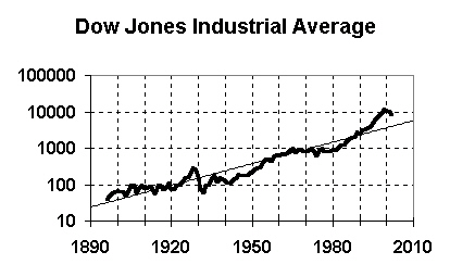 |
This graph makes it clearer how the 1990s bubble was similar to the 1920s bubble, and it shows how today's stock market fall is roughly following the 1930s path.
We expect today's stock market to follow roughly the same path as in the 1930s. This means that the DJIA will fall well below the trend line, to the 3,000 to 4,000 range, and won't return to the trend value, or exceed 6000, until well into the 2010s decade.
Some people consider the S&P 500 Stock Index to be more reliable than the DJIA. However, the results are the same.
 |
The adjoining graph shows the S&P 500 Stock index, adjusted for inflation, since 1870. The value in early 2003 is around 800. The graph shows a 2010 trend value of 589. These results are comparable to those obtained with the DJIA.
Let's now do a different kind of historical analysis, using a cyclic trend value rather than an exponential trend value.
The "price earnings ratio" (P/E ration) of a stock has historically indicated whether a stock is overpriced or underpriced. It's computed by dividing the price of each share of stock by the company's annual earnings per share of stock. (This can also be computed by dividing the total value of all outstanding shares of stock by the company's total annual earnings.)
This is not an exponential growth value, so we can't use exponential growth trend forecasting to analyze it. But we can use a historical comparison technique -- comparing the 1920s and beyond to the 1990s and beyond.
 |
The adjoining graph shows the P/E ratio for the S&P 500 stocks from 1881 to 2002.
As you can see, P/E ratios are typically between 10 and 20. (That is, stocks generally are priced between 10 and 20 times the company's annual earnings per share.) The value oscillates over time, and rarely goes below 5 or above 25.
There are only two times since 1881 when the average P/E ratio went above 30: in the 1920s and the 1990s. If we compare the 1930s values to today, we can see that we can expect the average P/E ratio to drop to about 6 or 7 in the 2005 or so time frame. This is consistent with the other findings we've presented.
The average P/E ratio is a very interesting value because it shows the level of confidence of investors. If an investor is willing to pay a price exceeding 20 times the earnings per share for a share of stock (P/E ratio greater than 20), then the investor would have to be very confident that the company was going to succeed and grow much faster than current earnings indicate.
Conversely, if an investor isn't willing to pay even 10 times earnings for a share of stock, then the investor is pessimistic about the company, and may believe that the company is going to lose market share, or even go bankrupt.
Using this measure, you can see that investor confidence spiked irrationally high in the 1920s, but then dropped very low as investors became increasingly risk aversive. Investor confidence grew steadily starting around 1950. As I've previously mentioned from my personal experience, my mother (and probably a lot of other people) were still very afraid of another depression and had little confidence that the stock market was safe. But confidence grew at that time, because we'd beaten the depression and we'd beaten the Nazis.
The P/E ratio grew until around 1967, when the country started to experience substantial unrest with demonstrations and riots protesting the Vietnam War. The P/E ratio fell fairly steadily until the personal computer started revolutionizing business in the early 1980s.
The P/E ratio spiked sharply upward starting around 1992, the time when investors who had any personal memory of the last P/E ratio spike (from the 1920s and 1930s) were retiring or dying off.
Since 2000, the P/E ratio has been falling steadily. Note that this crash was not caused by the 9/11/2001 attacks -- the crash began over 1 1/2 years before the 9/11 attacks.
Today, there's very little reason for any investor to regain anything like the confidence he had in the 1990s. Everyone has sobered up, and everyone now realizes that the 1990s bubble was a mistake that should not be repeated. That's why we should expect investor confidence to keep falling, and the P/E ratio to keep falling, and with it, the stock market.
It's fairly common these days for analysts to compare America's economic situation to Japan's situation.
Japan is ten years ahead of America, in the sense that The Tokyo Stock Exchange (TSE) had its big stock market bubble in the 1980s, rather than the 1990s. The TSE's bubble burst in 1990, while America's burst in 2000.
It's instructive therefore to look at what's happened to Japan since 1990, since the same thing may happen to America.
The graph below shows the value of Japan's Nikkei Stock Market Index since 1973. As you can see, the Nikkei stock market index was at around 40,000 in 1989, following a large bubble throughout the 1980s. The Japanese stock market crash began in January 1990, and has not ended to this very day, 13 years later.
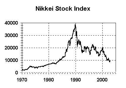 |
The Nikkei's value has dropped by 80%. This is a little more than the amount that the forecasting techniques we've used predict will happen in America.
For those who believe that the 1930s experience have taught us how to avoid a major stock market crash, the Japanese experience provides an answer. If we'd figured that out, then the Japanese would have applied that knowledge.
There is something remarkable about Japan's experience however: Although Japan's stock market has suffered an 80% loss, much greater than the American stock market loss in the 1930s, Japan has suffered a major financial crisis, but without massive business closings and homelessness. Why isn't there massive starvation and homelessness in Japan?
A new analysis of the Japanese economy provides the answer . By
examining data from thousands of companies, the researchers uncovered
a consistent pattern of Japanese banks loaning massive amounts of
money throughout the 1990s to firms that would otherwise have gone
out of business.
"The glue holding stock prices together in Japan has been copious lending by banks at ultralow rates, allowing even nearly insolvent companies to survive for years," according to the findings.
These loans have been possible because of the nature of the Japanese banking system, which essentially guarantees that the government will prop up any bank that otherwise would fail. The loans have permitted very weak companies from failing, and have also put many banks themselves into near insolvency. In fact, several major banks did fail in November 1997 and early 1998, and they were nationalized and saved. Since that time, stock prices on the TSE have been showing a remarkable volatility, very similar to the volatility of the New York Stock Exchange in the Great Depression of 1930s, but unlike anything seen since then.
The report indicates that time is quickly running out. More banks are approaching insolvency, and cash reserves are running out. This indicates that a major business collapse may be in the offing for Japan.
 |
It's worth mentioning briefly that sometimes a trend value can combine both cyclical and growth elements. Graphically, this is shown when the overall trend grows exponentially over time, but the actual value oscillates up and down, above and below the exponential trend line, as it follows the trend line.
Take a look at the above DJIA graph, which appears previously in this chapter. This represents economic growth, which grows exponentially but has cyclic elements.
Economic growth appears to grow according to the following rules:
The three oscillations in the last three paragraphs are completely independent and asynchronous. Sometimes they add to each other, sometimes they cancel each other out. But they have to be considered separately if one is to understand the cyclical nature of economic growth.
In the long run (time periods decades long), the oscillations are generally meaningless, and only the exponential growth is important. In the short run, it's the exponential growth that's generally meaningless, and the shorter cycles are more important.
The graph below is predicting a deflationary period after 2003, and in fact, as of early 2003, the economy has been getting increasingly deflationary. The Federal Reserve Open Market Committee, under Alan Greenspan, has adopted a reflationary policy by setting the overnight bank lending rate to historic lows, around 1%.
The purpose of this policy is to pump money into the economy. With more money in the economy, people will have more money and spend more money, creating a demand for products, causing businesses to expand to meet that demand. This concept has been the basis of theoretical economics for fifty years, whether in the form of "liberal" fiscal policy as developed by Maynard Keynes or "conservative" monetary policy, as developed by Milton Friedman.
However, the current economic problems are being caused by a very different problem, as described in chapter 6. The analysis in that chapter implies that deflation is being caused by very different problems: Because of generational changes, businesses have become increasingly inefficient, producing products that are of little interest to new generations.
 |
Under this analysis, deflation is occurring because people simply don't want the products being produced, and money has nothing to do with it. For example, teens aren't interested in buying CDs at any price; they want their music available over the Internet.
Furthermore, under this analysis, the Fed's reflation policy will have the same effect it's had in Japan since 1990: It permits companies that otherwise would have disappeared to stay in business by borrowing more and more cheap money, thus only postponing the problem, not repairing it.
As the nation heads for war, this will all be resolved. As the nation becomes militarily overextended and the draft is reactivated, weak businesses will go under and will be replaced by businesses producing products for the war effort. These businesses will be using the latest technologies and will be extremely efficient (as always happens in a crisis war, when the nation's survival is at stake), and will quickly adapt to become successful producers of commercial products when the war ends. The 2020s will be one of the most affluent, thriving decades in America's history.