Summary
The nature of messages that I receive from the public, and the fact that NASA Headquarters received more than 2500 inquiries in the past week about our possible manipulation of global temperature data, suggest that the concerns are more political than scientific. Perhaps the messages are intended as intimidation, expected to have a chilling effect on researchers in climate change.
The recent success of climate contrarians in using the pirated East Anglia e-mails to cast doubt on the reality of global warming* seems to have energized other deniers. I am now inundated with broad FOIA (Freedom of Information Act) requests for my correspondence, with substantial impact on my time and on others in my office. I believe these to be fishing expeditions, aimed at finding some statement(s), likely to be taken out of context, which they would attempt to use to discredit climate science.
There are lessons from our experience about care that must be taken with data before it is made publicly available. But there is too much interesting science to be done to allow intimidation tactics to reduce our scientific drive and output. We can take a lesson from my 5-year-old grandson who boldly says I dont quit, because I have never-give-up fighting spirit!
http://www.columbia.edu/~jeh1/mailin...tingSpirit.pdf
There are other researchers who work more extensively on global temperature analyses than we do our main work concerns global satellite observations and global modeling but there are differences in perspectives, which, I suggest, make it useful to have more than one analysis. Besides, it is useful to combine experience working with observed temperature together with our work on satellite data and climate models. This combination of interests is likely to help provide some insights into what is happening with global climate and information on the data that are needed to understand what is happening. So we will be keeping at it.
*By success I refer to their successful character assassination and swift-boating. My interpretation of the e-mails is that some scientists probably became exasperated and frustrated by contrarians which may have contributed to some questionable judgment. The way science works, we must make readily available the input data that we use, so that others can verify our analyses. Also, in my opinion, it is a mistake to be too concerned about contrarian publications some bad papers will slip through the peer-review process, but overall assessments by the National Academies, the IPCC, and scientific organizations sort the wheat from the chaff.
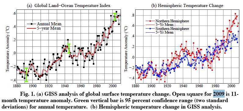
The important point is that nothing was found in the East Anglia e-mails altering the reality and magnitude of global warming in the instrumental record. The input data for global temperature analyses are widely available, on our web site and elsewhere. If those input data could be made to yield a significantly different global temperature change, contrarians would certainly have done that but they have not.

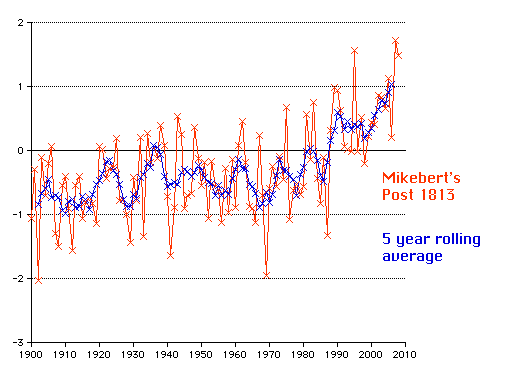
Originally Posted by Bob Butler 54