
Dynamics

|
Generational Dynamics |
| Forecasting America's Destiny ... and the World's | |
| HOME WEB LOG COUNTRY WIKI COMMENT FORUM DOWNLOADS ABOUT | |
Why we're headed for a financial crash.
The stock market reached its historic high in October, 2007, but two months earlier, in August, I wrote "How to compute the 'real value' of the stock market." This and other articles I had written resulted in a fair amount of derision directed at me, since at that time the financial experts and politicians were predicting that, except for an occasional minor bump in the road, the stock market would keep going up forever.
By the end of 2007, I was hearing far less derision, and as the stock market slumped in 2008, I actually heard some occasional grudging praise.
Then the rally occurred in 2009, and since then some level of derision has recurred.
In this article, I'm going to update the diagrams, and outline the reasons why we're still headed for a stock market crash.
Most investors today are no different from drunken gamblers at roulette tables in Las Vegas. When they aren't playing, they're desperate and depressed. When they make money, they experience a burst of endorphins that keeps them happy for hours. When they lose money, they obsessively double their bets. Brokers have the best of all worlds, since they get to do all of that with other people's money, and then collect fat commissions.
For those investors who wish to make stock purchases based on real value, there's only one reliable measure: past earnings. And you can obtain a measure of the value of a share of stock by means of the price/earnings (P/E) ratios (also called "valuations") -- divide the current stock price by total earnings in the last year.
The average P/E ratio for the S&P 500 stocks between 1871 to 1995 was 13.91. This means that if you purchased an average share of stock a year ago, then the company would have earned 1/13.91 = 7.2% of the share price.
Here's a graph of the price/earnings ratio from 1871 to the present:
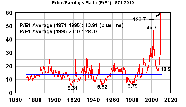 |
As you can see from this graph, the P/E ratio has really skyrocketed since 1995, much higher than its historical average at several points, and ALWAYS higher than its historical average since 1995.
Now, the Law of Mean Reversion says that the average (mean) since 1995 also has to equal roughly 13.91, and if it doesn't, then the average will eventually revert to its historic average. In order to do that, the P/E ratio must go BELOW 13.91 for roughly the same amount and period of time as it was ABOVE 13.91 -- i.e., for 15 years.
This means that the P/E ratio must fall well below ten, and stay there for years. There are people who say "this time it's different," but the burden of proof is on them to explain why it's different.
One fantasy argument that these people use is that we're using "old data" that applied to the doddering old fools who lived years ago and didn't even have iPhones. Well, when the 1929 crash occurred, those doddering old fools were young, and were giving similar reasons why "this time it's different."
In fact, as you can see from the graph, the P/E ratio was as low as 6.79 very recently -- in 1980. If it can fall to 6.79 in 1980, then it can certainly do so again today, and anyone who thinks otherwise is a fool.
Claiming "this time it's different" is a fantasy. Just one look at that graph will tell you that we're headed for the biggest crash in history, much larger than the 1930s crash. This is a mathematical certainty.
When will this crash occur? It's impossible to predict, of course, but here's one way to look at it:
Notice that the three points that I labeled as lows (5.31, 5.82 and 6.79) occurred at 31-year intervals. (But there's nothing like that in 1887, so this may be completely wrong.) So we have to consider the possibility that there's some kind of as-yet not understood 31-year cycle in price-earnings ratios. With only three data points, it's hard to be anywhere near certain. However, if the 31-year cycle holds, then the next low will be in 2011.
The average financial "expert" doesn't consider any historical data relevant. Something that I hear all the time on CNBC or Bloomberg TV is that a stock is "oversold, because its price is lower than the 200 day moving average." In other words, to these "experts," nothing that occurred more than 200 days ago is even relevant to the stock price.
The very high values of the P/E index since 1995 indicate that we've been in a huge bubble. A bubble does permanent harm to an economy, and that harm lasts much longer than 200 days. In fact, a bubble can be compared to a poison that harms every nook and cranny of the economy for a long time.
Let's take the obvious example of the real estate bubble. When that crashed, it obviously affected things a lot longer than 200 days. In fact, the effects today are far from over. The overall foreclosure rate is still increasing. The shadow inventory is so large that even mainstream forecasters are saying that prices will be falling for years. That's an obvious example of how a bubble has longer effects than 200 days.
Another obvious example is the level of personal debt. During a bubble, there's plenty of money available in the form of debt, and so people go deeply into debt, expecting that there'll be more money (credit) in the future to pay off the old debt. At some point, when the credit bubble crashes, and there's no more debt money available, people have to start paying off their debts, and that can take years.
The same kind of thing is true for every business. Businesses borrow a great deal of money during a bubble, and use the money to hire new employees. When they can't borrow anymore, they lay employees off, and don't hire any more. This creates joblessness that lasts for years.
There's another aspect that applies to business. During a bubble, the world looks different than it does after the bubble bursts. In the bubble world, no expense is spared for glamour, with the result that businesses spend their resources on developing the labor and infrastructure to develop and manufacture products that only interest consumers during the bubble. Once the bubble ends, these businesses turn out to have the wrong kinds of employees with the wrong kinds of skills and the wrong kinds of infrastructure. Years are required for the business to figure out what the correct products should be, and to hire employees with the right skills. In the meantime, many of them go out of business.
Every person and business in the country is affected by the bubble. When the bubble ends, it takes many years to pay off debts and restructure businesses. During this time, the P/E average is much lower than it would have been if there had been no bubble.
The auto industry is an obvious example of this. During the bubble, people traded in their cars for new models more often than necessary, and they chose their new cars for prestige value. Large SUVs were the norm. Once the bubble burst, the market shifted away from SUVs, and people held on to their cars much longer, resulting in significant problems for the industry.
The poison that filled every corner of the economy, starting in 1995, was debt. Debt filled the business economy, debt filled the consumer economy, and debt filled the government economy -- in America, in Europe, in China, and elsewhere. The poison created consumer products, created jobs, and created a risk-seeking population. It takes as many years to remove the poison as it did to create it.
One obvious sign of this is that trillions of dollars of "toxic assets" are still in financial portfolios around the world at nominal value -- without having been "marked to market." This "deleveraging" process has already taken several years and has hardly begun. It will take much longer than 200 days. (Paragraphs added - 4-Aug)
That's why the Law of Mean Reversion works. Don't blame me. I didn't make up the Law of Mean Reversion. I'm only telling you what it says.
When the Great Depression survivors (GI and Silent generations) were running things, they were very risk-averse and very careful with their investments. The P/E ratio was one of their main tools.
When the Silents finally retired in the 1990s, and the Boomers took over in senior management positions, the dot-com bubble began in 1995 (as well as the global real estate bubble).
Since the price/earnings ratios were suddenly out of whack, financial "experts" came up with several alternative ways to compute the P/E ratio to justify the bubble prices:
At this point, you rarely even hear about P/E earnings or valuations used much, or if there's a financial "expert" on tv who refers to valuations, he pulls a number (like 10) out of the air, and announces that stocks are underpriced. It's absolutely incredible.
In 2002, I was eating lunch at the mall reading the Boston Globe, when I saw a graph of the Dow Industrials going back to the early 1900s. I took one look at it and said, "Ohmigod, the stock market is going to crash." It was that obvious, just from the graph.
The graph must have looked something like the following:
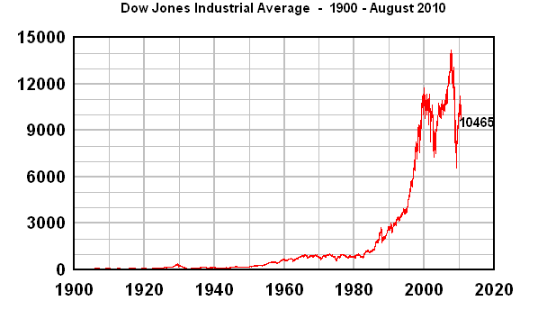 |
Since I was familiar with exponential curves and growth forecasting, I could see immediately that the DJIA had been growing sharply faster than exponential growth since about 1995, and that meant that we had to have a crash.
Let me start by pointing out a big mistake that I see all the time on the internet. Some people, looking at the above graph, would say that the DJIA was pretty much linear at the beginning, and only began exponential growth around 1960 or 1980. I see this kind of claim with regard to long-range population charts or other charts, all over the internet.
In fact, the curve is exponential from the beginning. The only reason that it isn't evident is because the values at the beginning are too small.
One way to see it is to add a "best fit" historical exponential curve. The blue line in the next graph is a best fit exponential curve from 1904-1994 (I've experimented with other year ranges, and it doesn't affect the final conclusion):
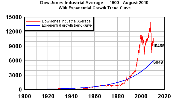 |
What this graph shows is that the long-term trend value of the DJIA at the present time is around 6049, and that's the value that could currently be called the "real value of the stock market." By the Law of Mean Reversion, the index will fall far below that amount to compensate for the period since 1995 when it war far above value. Because of the length of time that the DJIA has been above average, my expectation is that it will fall well below 3000 before everything is over.
To make it clearer that the early part of the graph is not linear, let's restrict the above graph to the years 1900-1950:
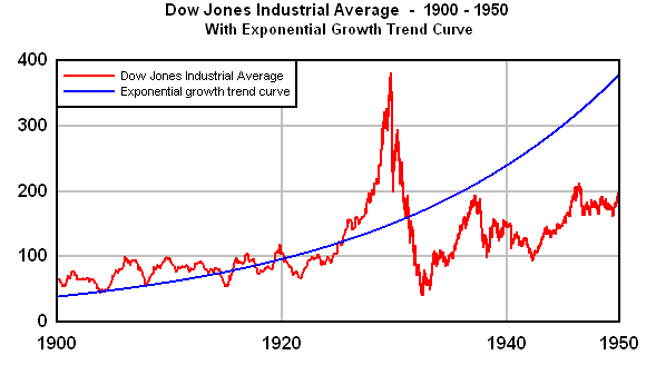 |
What happened in those years was that the bubble of the 1920s crashed in 1929, and the DJIA was below the long-term trend line for a long time, only catching up around 1960.
The best way to display a long-range exponential growth curve, including a population curve, is on graph with a logarithmic Y-axis, as follows:
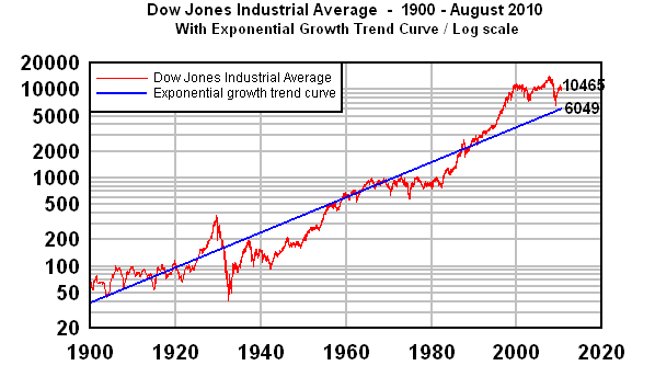 |
With a logarithmic scale, the exponential "curve" becomes a straight line, and you can easily when the DJIA is above or below the trend line.
I use the mathematical term "points of inflection" in a somewhat informal way, to indicate points in the graph that take a sharp turn (indicating that the second derivative is infinite).
Take a look at the following graph of the DJIA since 1950:
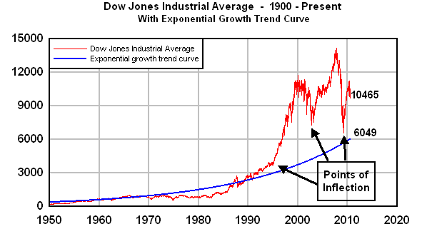 |
Prior to 1995, the graph of the DJIA moved in a fairly steady manner, not counting the minor jitters that occur every day. But in 1995, something very different happened. You can see that the graph should have leveled off and started falling, but instead, it turned a sharp corner to the left and moved rapidly upward, resulting in the tech bubble.
Economists are completely baffled by this. They certainly didn't predict it, and even now, they have absolutely no explanation for it.
As I always like to point out, mainstream economists didn't predict or explain the tech bubble, or why it occurred in 1995 instead of 1985 or 2005. They didn't predict and can't explain the real estate bubble, the credit bubble, the credit freeze, the financial crisis, or the worldwide trade and transportation freeze. They can't explain what's happening today, and they have no idea what's coming next year.
I've often complained that mainstream economists must have some kind of brain blockage or mental deficiency, because they seem completely incapable of seeing a generational explanation, no matter how utterly obvious it is.
And in this case, the generational explanation is perfectly obvious. This was the time that the survivors of the 1930s Great Depression all disappeared (retired or died), all at once, leaving the incompetent Boomers to take senior management positions.
Once the tech bubble crashed in 2000, a different dynamic took place. Generation-Xers who were caught in the Nasdaq crash began reaching their 40s, and began taking middle management positions in organizations. Their contempt for Boomers and Silents is well known, and it's well documented that the Generation-Xers created the tens of trillions of dollars of synthetic mortgage-backed securities that created the financial crisis. That explains the point of inflection around the year 2003.
Since my 2007 article, I've added a third point of inflection, occurring around March 2009, the beginning of the 2009 rally.
This was caused by the massive worldwide bailout and stimulus injection. Some $10 trillion of bailout and stimulus money was poured into the economies of America, Europe, China, and other countries. In doing so, the stock market bubble, which was in the middle of crashing, was revived again.
As you can see from the last part of the graph, the stock market seems to have begun its descent again. I would be very surprised if any bailouts or stimuli or quantitative easings will have anything like the effect they had in 2009, but I've been wrong about this before.
Things are quite different today than they were at the beginning of 2009 when these massive liquidity injections occurred. The U.S. debt level is almost unimaginably higher, so much so that any further major bailout or stimulus would be met with enormous domestic and international political opposition. China's economy is in a massive bubble, and Beijing has been doing everything possible to slow it down. Several European countries are deeply in debt (remember the PIIGS?), and more stimulus is out of the question.
If I were to speculate (and these speculations have not always been correct), I would say that it appears that the stock market indexes will continue falling, subject to minor perturbations, and that the DJIA will be much lower by 2011.
That may be a speculation, but there is one thing that's absolutely certain: By the Law of Mean Reversion, the stock market MUST fall sharply at some point. Whether it's 2010 or 2011 or 2012 remains to be seen, but it is a mathematical certainty.
Some people ask me why I don't use P/E10 -- price divided by the average earnings over the previous ten years. In fact, I used to use P/E10, but I decided that people understand P/E1 better, and that it makes the same point -- that by the Law of Mean Reversion, there will be a stock market crash.
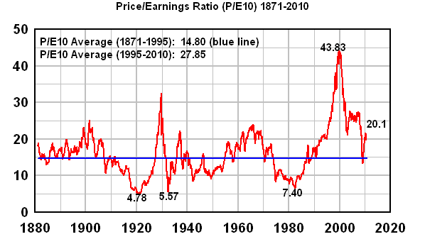 |
The P/E10 graph looks a little different than the P/E1 graph since, by averaging earnings over ten years, the results are less volatile and extreme. Nonetheless, you can see that there was a huge bubble from 1995 on, and the Law of Mean Reversion requires that P/E10 fall below the long-term average for an equivalent amount of time. Once again, this graph makes clear that we're headed for the greatest financial crash in history.
(Comments: For reader comments, questions and discussion,
see the Financial Topics thread of the Generational Dynamics forum. Read
the entire thread for discussions on how to protect your money.)
(3-Aug-2010)
Permanent Link
Receive daily World View columns by e-mail
Donate to Generational Dynamics via PayPal
Web Log Summary - 2016
Web Log Summary - 2015
Web Log Summary - 2014
Web Log Summary - 2013
Web Log Summary - 2012
Web Log Summary - 2011
Web Log Summary - 2010
Web Log Summary - 2009
Web Log Summary - 2008
Web Log Summary - 2007
Web Log Summary - 2006
Web Log Summary - 2005
Web Log Summary - 2004
Web Log - December, 2016
Web Log - November, 2016
Web Log - October, 2016
Web Log - September, 2016
Web Log - August, 2016
Web Log - July, 2016
Web Log - June, 2016
Web Log - May, 2016
Web Log - April, 2016
Web Log - March, 2016
Web Log - February, 2016
Web Log - January, 2016
Web Log - December, 2015
Web Log - November, 2015
Web Log - October, 2015
Web Log - September, 2015
Web Log - August, 2015
Web Log - July, 2015
Web Log - June, 2015
Web Log - May, 2015
Web Log - April, 2015
Web Log - March, 2015
Web Log - February, 2015
Web Log - January, 2015
Web Log - December, 2014
Web Log - November, 2014
Web Log - October, 2014
Web Log - September, 2014
Web Log - August, 2014
Web Log - July, 2014
Web Log - June, 2014
Web Log - May, 2014
Web Log - April, 2014
Web Log - March, 2014
Web Log - February, 2014
Web Log - January, 2014
Web Log - December, 2013
Web Log - November, 2013
Web Log - October, 2013
Web Log - September, 2013
Web Log - August, 2013
Web Log - July, 2013
Web Log - June, 2013
Web Log - May, 2013
Web Log - April, 2013
Web Log - March, 2013
Web Log - February, 2013
Web Log - January, 2013
Web Log - December, 2012
Web Log - November, 2012
Web Log - October, 2012
Web Log - September, 2012
Web Log - August, 2012
Web Log - July, 2012
Web Log - June, 2012
Web Log - May, 2012
Web Log - April, 2012
Web Log - March, 2012
Web Log - February, 2012
Web Log - January, 2012
Web Log - December, 2011
Web Log - November, 2011
Web Log - October, 2011
Web Log - September, 2011
Web Log - August, 2011
Web Log - July, 2011
Web Log - June, 2011
Web Log - May, 2011
Web Log - April, 2011
Web Log - March, 2011
Web Log - February, 2011
Web Log - January, 2011
Web Log - December, 2010
Web Log - November, 2010
Web Log - October, 2010
Web Log - September, 2010
Web Log - August, 2010
Web Log - July, 2010
Web Log - June, 2010
Web Log - May, 2010
Web Log - April, 2010
Web Log - March, 2010
Web Log - February, 2010
Web Log - January, 2010
Web Log - December, 2009
Web Log - November, 2009
Web Log - October, 2009
Web Log - September, 2009
Web Log - August, 2009
Web Log - July, 2009
Web Log - June, 2009
Web Log - May, 2009
Web Log - April, 2009
Web Log - March, 2009
Web Log - February, 2009
Web Log - January, 2009
Web Log - December, 2008
Web Log - November, 2008
Web Log - October, 2008
Web Log - September, 2008
Web Log - August, 2008
Web Log - July, 2008
Web Log - June, 2008
Web Log - May, 2008
Web Log - April, 2008
Web Log - March, 2008
Web Log - February, 2008
Web Log - January, 2008
Web Log - December, 2007
Web Log - November, 2007
Web Log - October, 2007
Web Log - September, 2007
Web Log - August, 2007
Web Log - July, 2007
Web Log - June, 2007
Web Log - May, 2007
Web Log - April, 2007
Web Log - March, 2007
Web Log - February, 2007
Web Log - January, 2007
Web Log - December, 2006
Web Log - November, 2006
Web Log - October, 2006
Web Log - September, 2006
Web Log - August, 2006
Web Log - July, 2006
Web Log - June, 2006
Web Log - May, 2006
Web Log - April, 2006
Web Log - March, 2006
Web Log - February, 2006
Web Log - January, 2006
Web Log - December, 2005
Web Log - November, 2005
Web Log - October, 2005
Web Log - September, 2005
Web Log - August, 2005
Web Log - July, 2005
Web Log - June, 2005
Web Log - May, 2005
Web Log - April, 2005
Web Log - March, 2005
Web Log - February, 2005
Web Log - January, 2005
Web Log - December, 2004
Web Log - November, 2004
Web Log - October, 2004
Web Log - September, 2004
Web Log - August, 2004
Web Log - July, 2004
Web Log - June, 2004